The Beginning
In our fiercely competitive landscape, a robust digital presence is paramount. This narrative unfolds over a 3-month odyssey, where I, as a designer, embarked on a mission to reimagine the outdated website for a Fintech powerhouse—Oystr Finance.
Oystr Finance stands out from the crowd, eschewing conventional thinking. Their core ethos revolves around shaping a brighter future through an array of innovative products. At the heart of their mission lies the commitment to empower 30 million African adults with crucial identity, financial data, and credit history by 2025. This strategic initiative aims to seamlessly integrate them into the credit system, fostering financial inclusion and progress.
What Does Oystr Do?
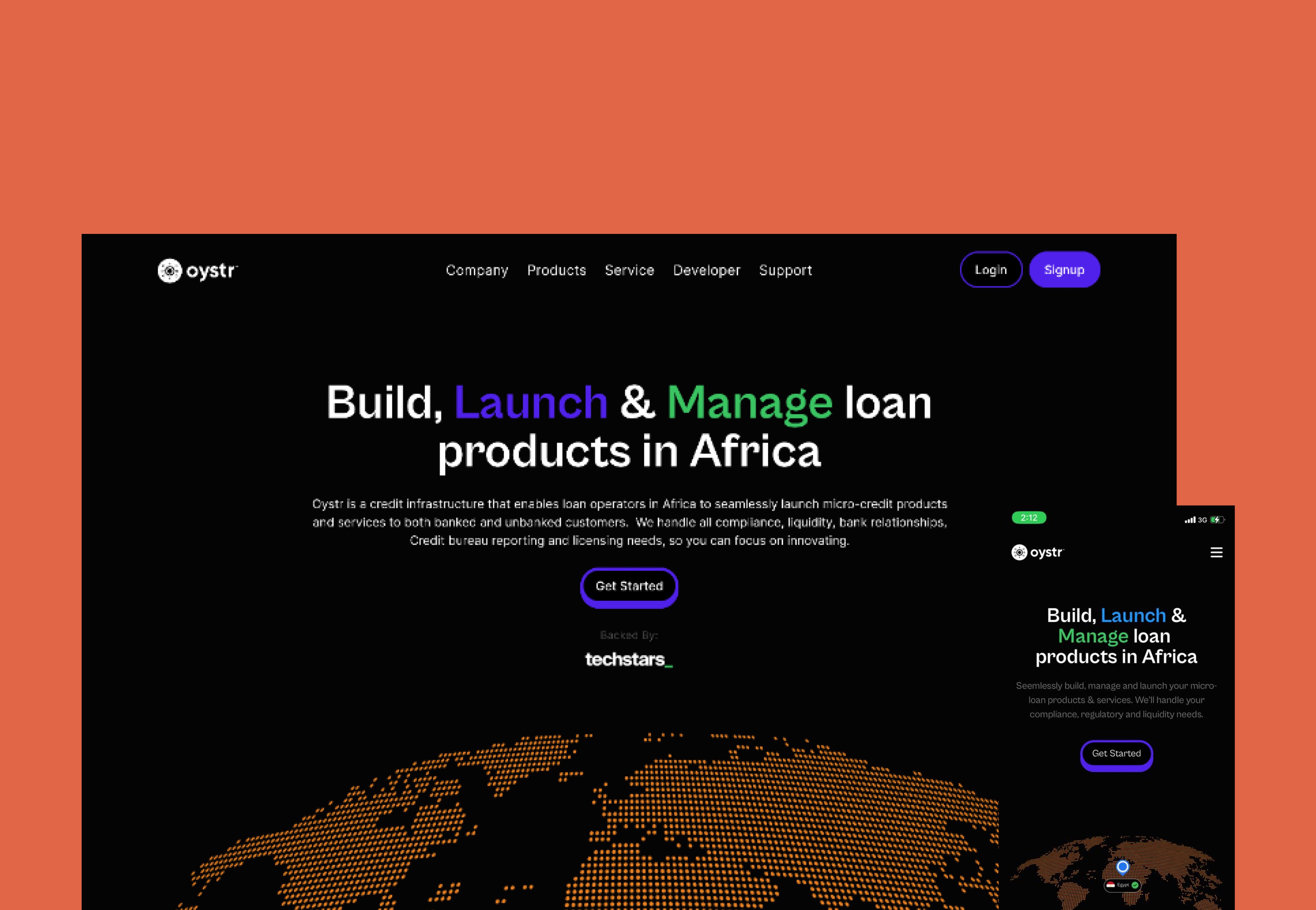
Oystr Finance one of Africa's largest financial service infrastructures making it easier for loan operators and financial services providers to build, run and manage micro-credit products and services for both banked and unbanked Africans.
Their website, however failed to mirror this dynamism. Aesthetically, it resembled a chaotic visual clutter, falling short of capturing the essence of the brand's purpose. The absence of a structured content layout amplified confusion rather than promoting coherence.
The Solution: A Website Redesign
My task was to develop a system that logically conveyed the essence of the company and its offerings. Additionally, it was imperative to devise a contemporary and visually appealing style that would illuminate the brand's personality.
Design Process
I firmly advocate that articulating how a solution should function, identifying the problems to address, and pinpointing the benefits to emphasize form the core and fundamental aspects of any successful design process. Even if one feels confident in knowing the answer to a brief, it is crucial to take a step back and delve into research to ascertain if the focus is on the right problem to solve. In this context, a beginner's 'curious' mindset is instrumental in revealing accurate business objectives, genuine user needs, and technological possibilities.
Consequently, our project initiation involved a comprehensive investigation of both internal (company) and external (user) drivers. This step aimed to crystallize the potential solution's scope, outlining how the website should operate rather than focusing on its visual aesthetics. This process unfolded in fours distinct steps:
Step 1 — Kick off to refine business requirements.
Commencing with several workshops involving key stakeholders (the business) was essential to grasp the brand vision, overall goals, and challenges. We needed their perspective on:
Internal: The business needs, requirements, and goals were a primary focus during these workshops.
External: Simultaneously, i sought insights into the external landscape, encompassing context, competitors, and best practices.
Stressing the importance of documenting these insights, creating a single source of truth became pivotal. This repository would inform decision-making processes and foster team alignment.
Step 2 — Site and Content Audit
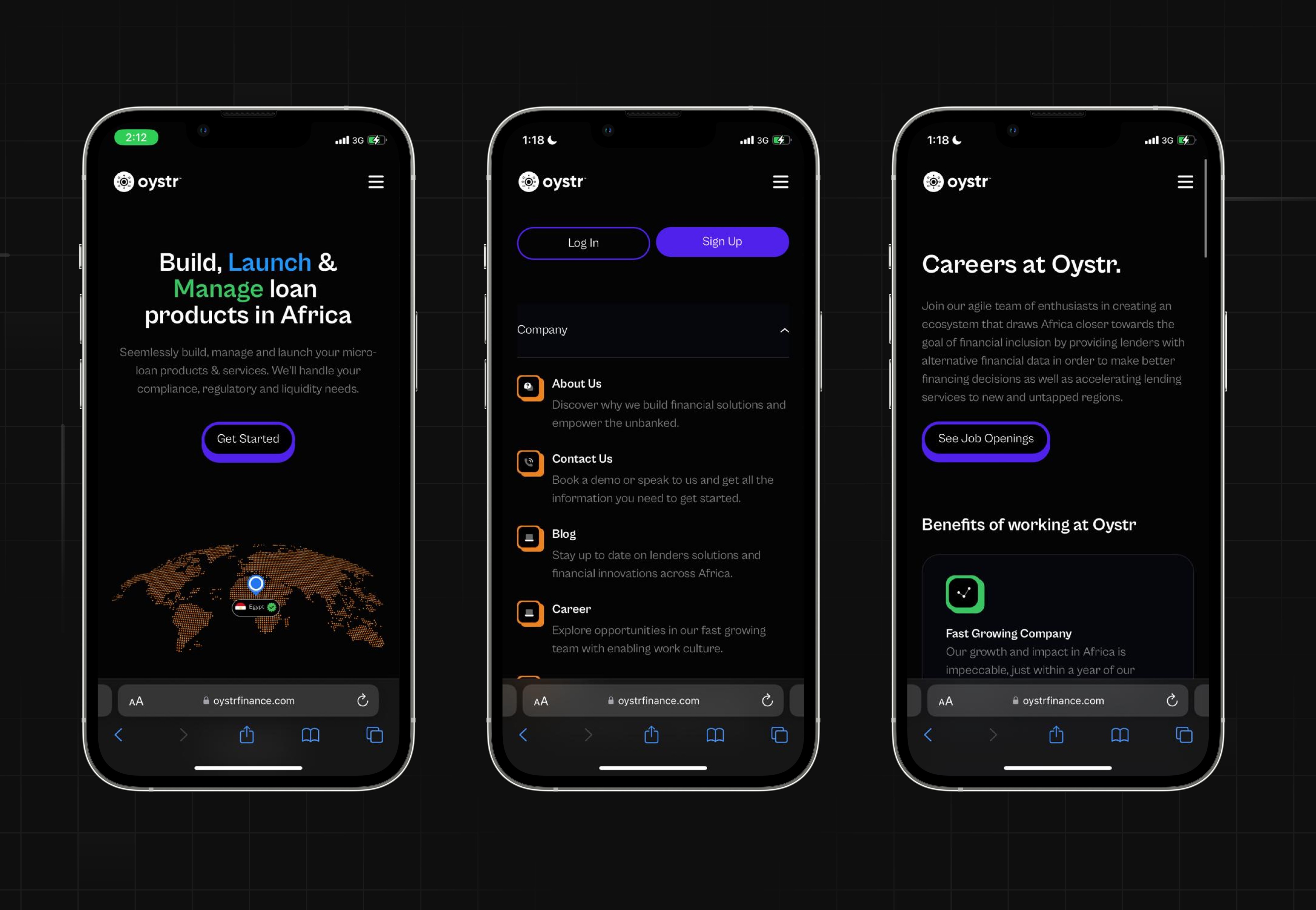
Ensuring a delightful user experience on the website involves the anticipation of user needs and the delivery of relevant information at each step. The site structure, informed by the diverse journeys of different user types, was designed to streamline user flows. This involved a careful evaluation, leading to the removal of unnecessary pages, merging of existing ones, and the addition of new pages as necessary.
Step 3— Context exploration
Once we had a broad understanding of the website's purpose, the next challenge was establishing a system for presenting diverse content. In this endeavor, our inspiration was drawn from contemporary design trends.
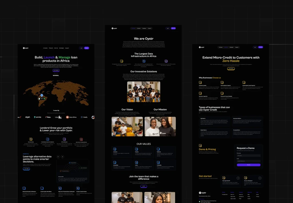
Step 4 — Wireframes
At last, with the planning and foundational work complete, we delved into crafting wireframes for the core desktop experience. Knowing the 'why' and 'what' of our design objectives made the process of constructing pages straightforward. Despite navigating through feedback loops, the flexibility to rearrange elements without entangling design ego in graphics proved to be quite seamless.
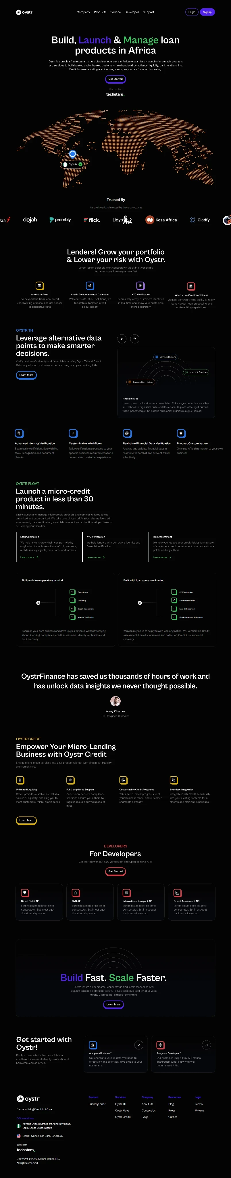
The fundamental principle here is clear: every page must effectively communicate its goal and address key user questions and concerns. This necessitates a logical structure that enables users to swiftly scan the page.
Emphasizing content prioritization, once the page's objectives are defined, attention can then shift to refining elements and graphical composition.
Delivery Phase
Conclusion
In retrospect, reviewing this process allowed us to distill essential insights, identify critical turning points, and pinpoint blockers that warrant elimination. These reflections offer valuable learnings to enhance our approach in future endeavors.
Key Takeaways:
Commence the design process only when all business requirements are thoroughly understood.
Prioritize satisfaction with the solution's functionality (UX) before delving into visual design.
Dedicate ample time during the discovery phase to contemplate the validity of chosen strategies. Ensure the alignment of actions with the right objectives and rigorously validate all assumptions before any code is written.
Read Similar
Here are more case studies for you to read
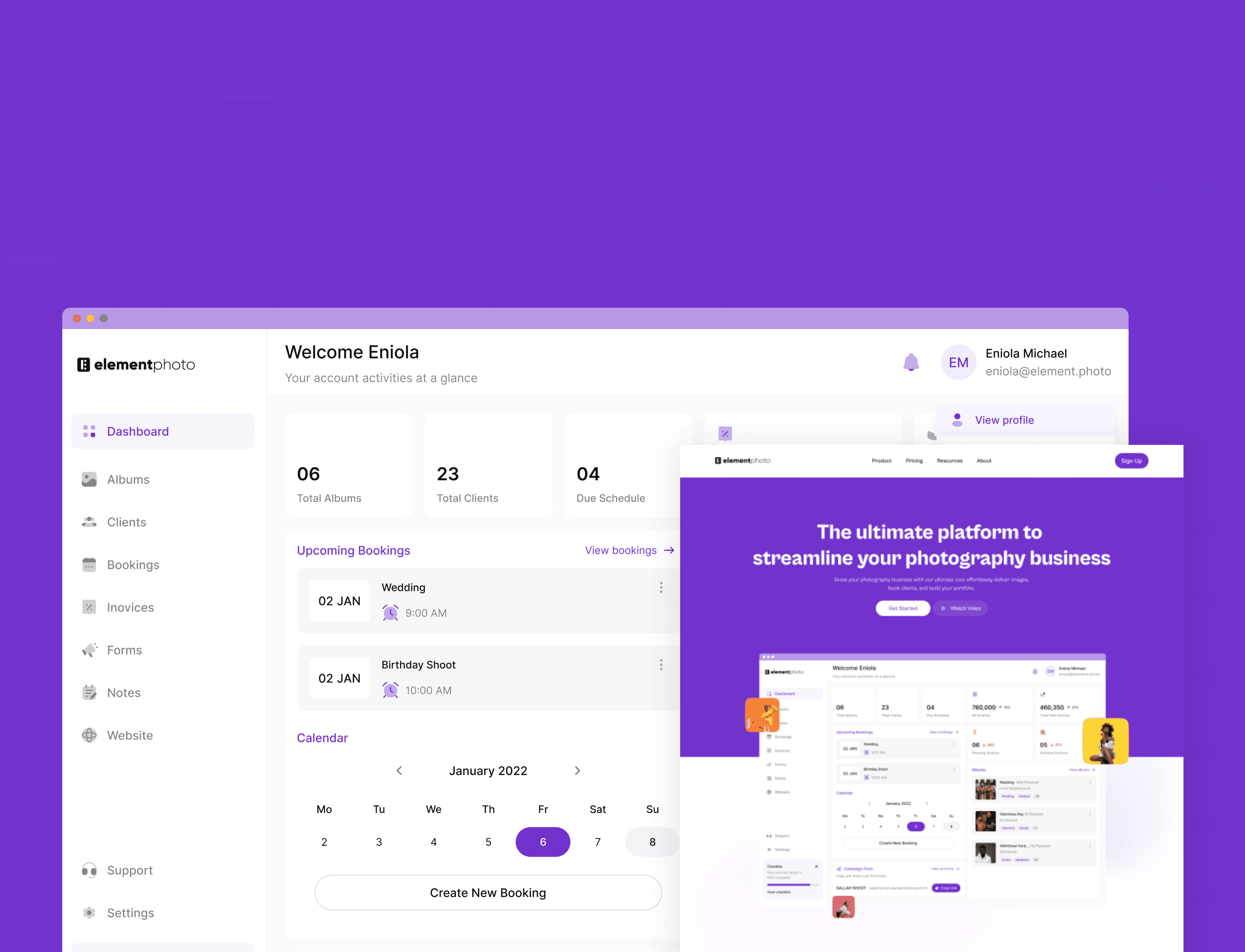
Web-App & Website For Element Photos
Element Photos/2023
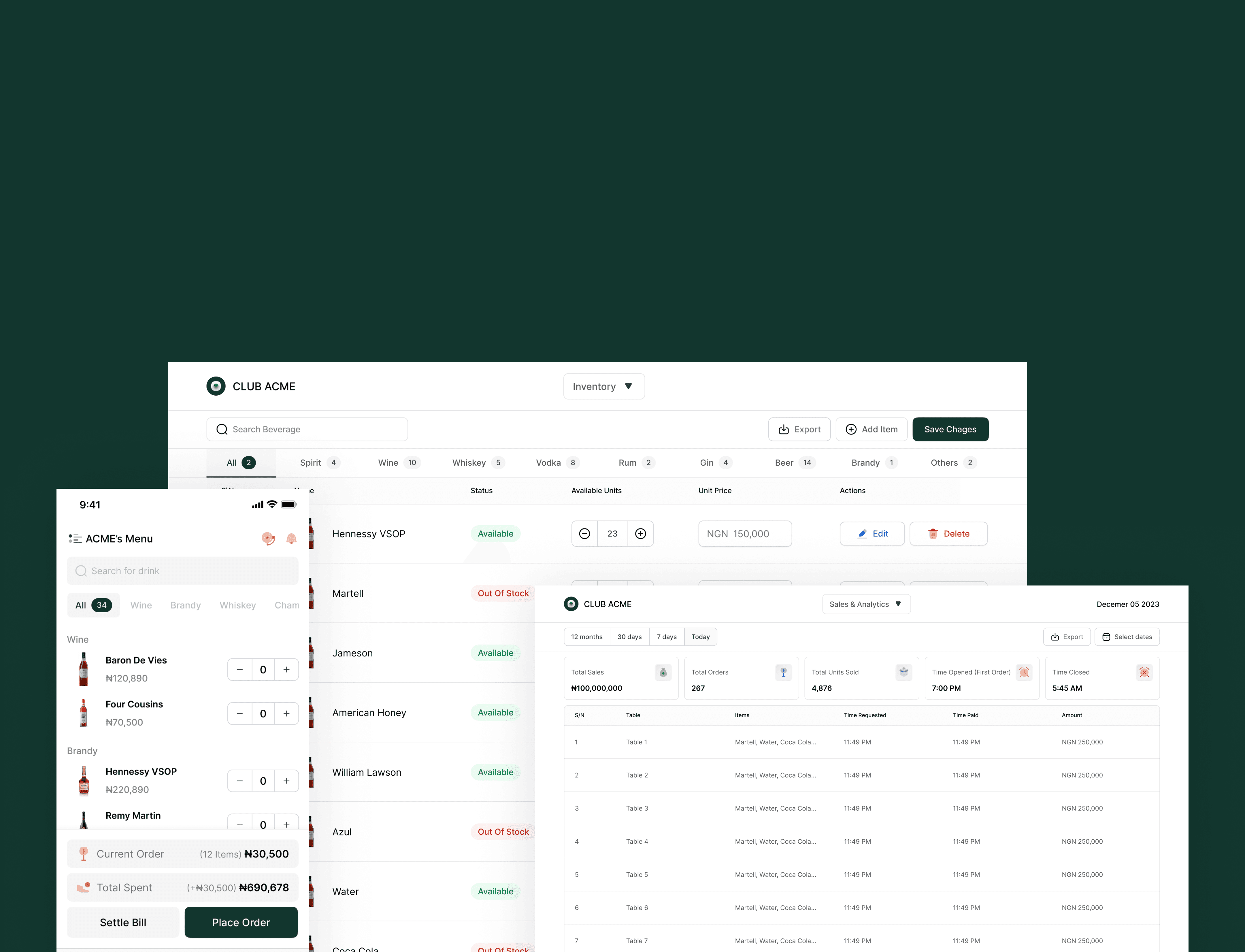
Order Management Software For Tables
Tables/2023
Designed And Built By Me